WECHIPN: UX Design (Mobile/Web App)
WeChipn is a social organization in partnership with Live Nation that pushes for social action and community building. Their mission is to catalyze One Billion actions worldwide by 2028—empowering a global community of forward-thinkers and activists. I came on as UX/UI designer for this project, designing all screens myself and supporting the team with front-end code so the experience stayed true to the vision from concept to launch.
The Old Experience
When I joined, the existing interface was hard for users to navigate and didn’t resonate with the audience WeChipn wanted to reach. The home experience, signup flow, and volunteer-drive pages felt disconnected and dated—so I started by documenting what was there and where people were dropping off.
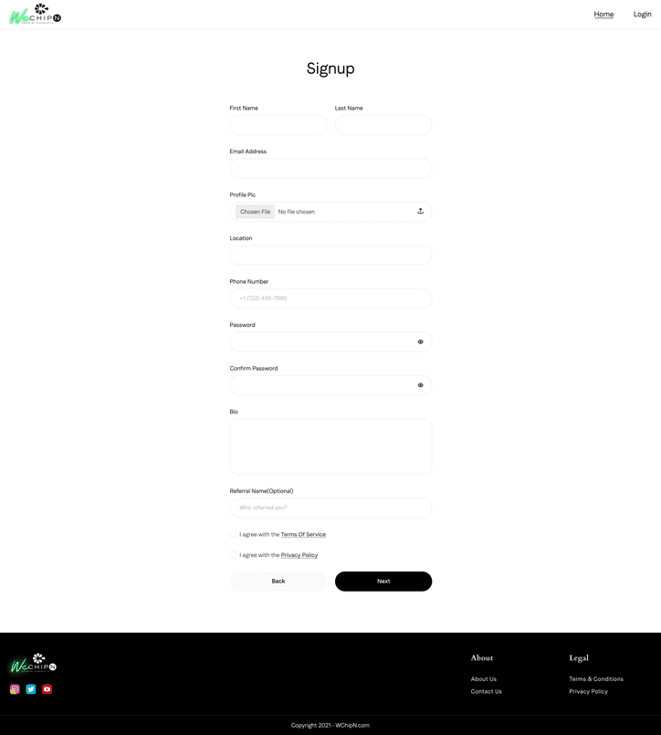
WeChipn was struggling to retain users. Complicated flows and outdated patterns made it hard to engage the customer base—and that was limiting growth. The opportunity was real: a clearer, more modern experience had the potential to significantly improve retention, with early estimates pointing to at least 50% if we got the design right. I treated this as a high-impact, complex problem from the start. Every design decision was grounded in direct user feedback, estimated conversion impact, and how well the system would scale. I moved quickly and relied on rapid feedback—shipping iterations, testing with real users, and refining so we could learn fast without losing sight of the bigger picture.
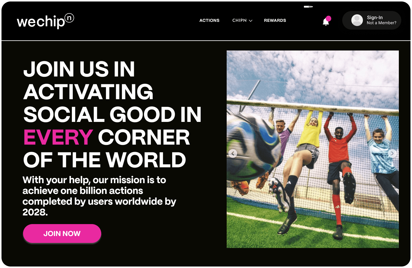
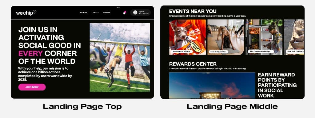
I led with a new landing experience that put big, clear copy and strong CTAs front and center—speaking to people who care about community but also expect a product that feels current and intentional. As you scroll, the product reveals itself through bold CTAs and real photos from community events, so the brand and the mission feel tangible, not abstract.
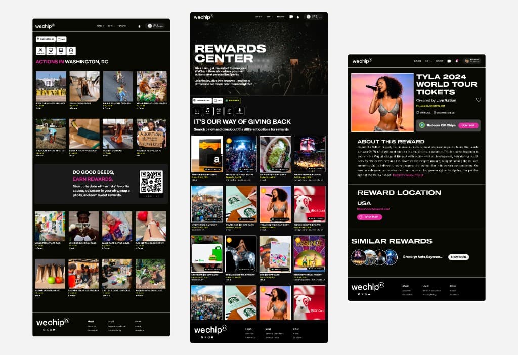
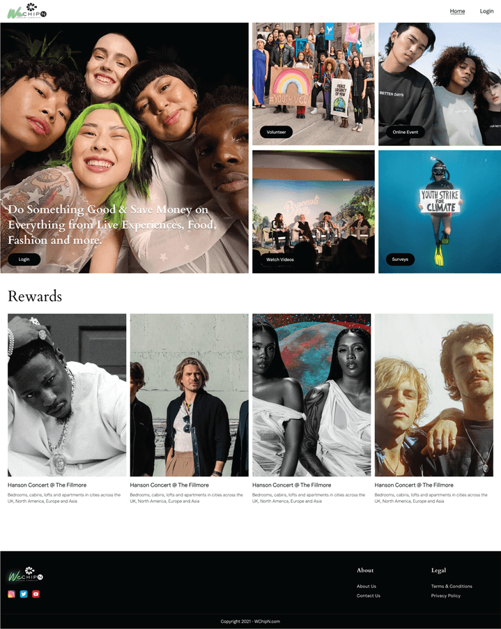
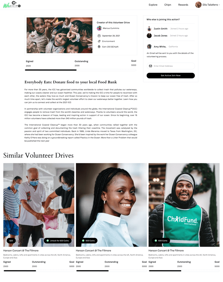
The Rewards Center and Actions experience is where the model really comes to life: users earn points by taking action in their community—volunteering, attending events—and then redeem those points for concerts and other rewards. I designed both flows with large, legible CTAs and location-based filtering so what you see is relevant to where you are. The filters use clear filled and unfilled states, and the actions and rewards update by location so the experience stays relevant and easy to scan.
Design Decision
I mapped the full user journey to find where we could have the biggest impact. Signup dropoff had several possible causes, but the clearest lever was the homepage: it had to feel more dynamic and engaging for a younger, community-minded audience without burying the information they needed to understand the initiative. So I focused there first—making the hero and scroll experience do more of the work.
Mobile View
The whole product is responsive, and I treated mobile as a first-class experience—same level of engagement and clarity, just tuned for the small screen. Primary CTAs live in a hamburger menu so the main content has room to breathe, and the desktop three-column layout becomes a single-column, image-forward flow on mobile so events and rewards stay easy to browse on the go.
Design — Swank x WeChipn
If we had had more time, I would have kept testing after launch to see how people actually engaged with the product—but even within the timeline we had, working side by side with engineering made the handoff smooth. I knew how the designs were meant to behave, and that made it easier to ship something that felt right.